*Some client details have been changed to protect privacy
Overview
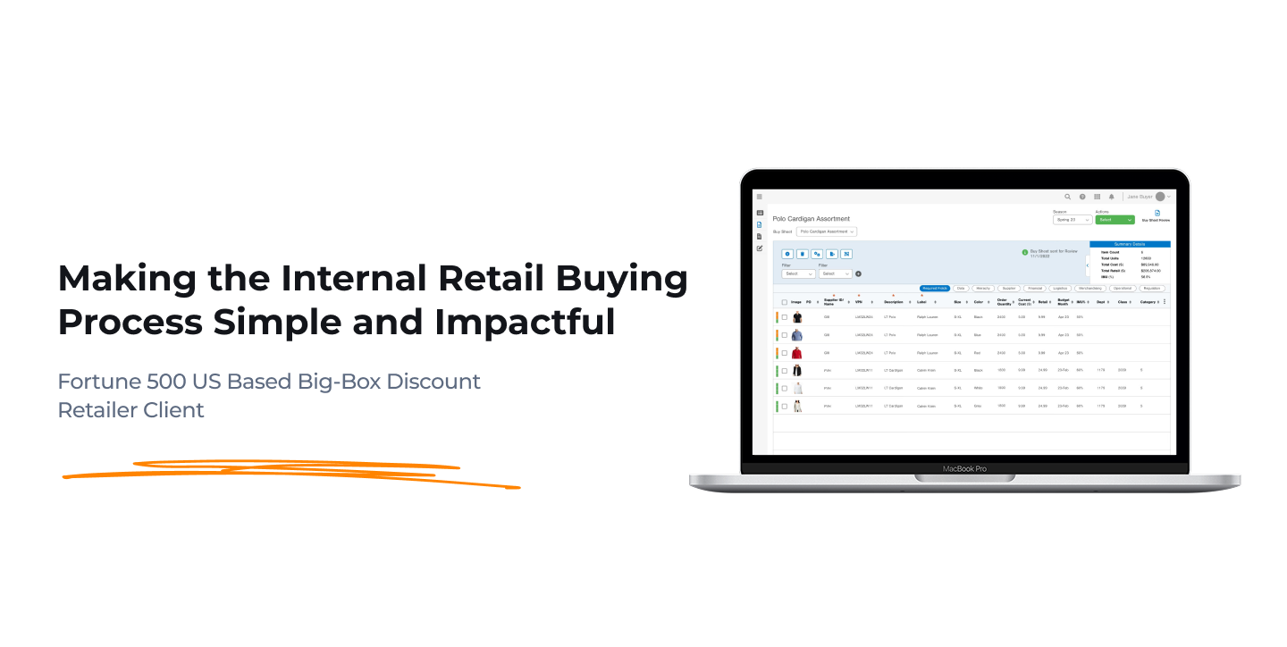
The client needed a revamped reporting and buying experience for their internal buyers.
The older system relied too heavily on Excel, which just created confusion for vendor tracking, receipt organization, and note sharing.

They wanted this to be shareable, versioned, and user-friendly.
My Role
➡️ Created interactive mid-fidelity prototypes for a new web-based enterprise-wide solution for buyers to create, edit, store, and share important process documents such as Buy Sheets, Assortment Sheets, and Purchase Orders.

➡️ Collaborated with the core strategy team to create flow documentation and prototypes while fleshing out best practices.
High-Level Result
Cut buy sheet and vendor receipt creation time by 30% (15min - 10min)
Here's how I got there...
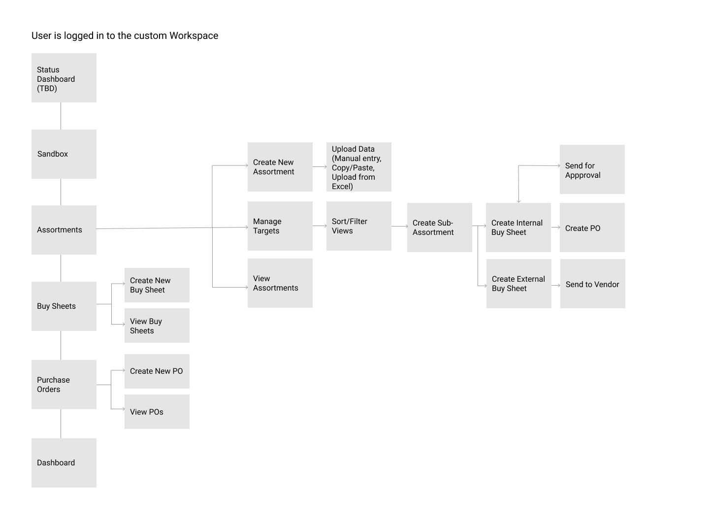
High-Level Information Architecture
Starting, the design team had to skip the initial discovery phase due to time constraints. The client was fine with the potential lack of traditionally gathered user data to get initial design idea off the ground. The client wasn't having design conversations at all, and we needed to go "blue sky" with it. 

This is a very typical trade-off that happens in consulting.
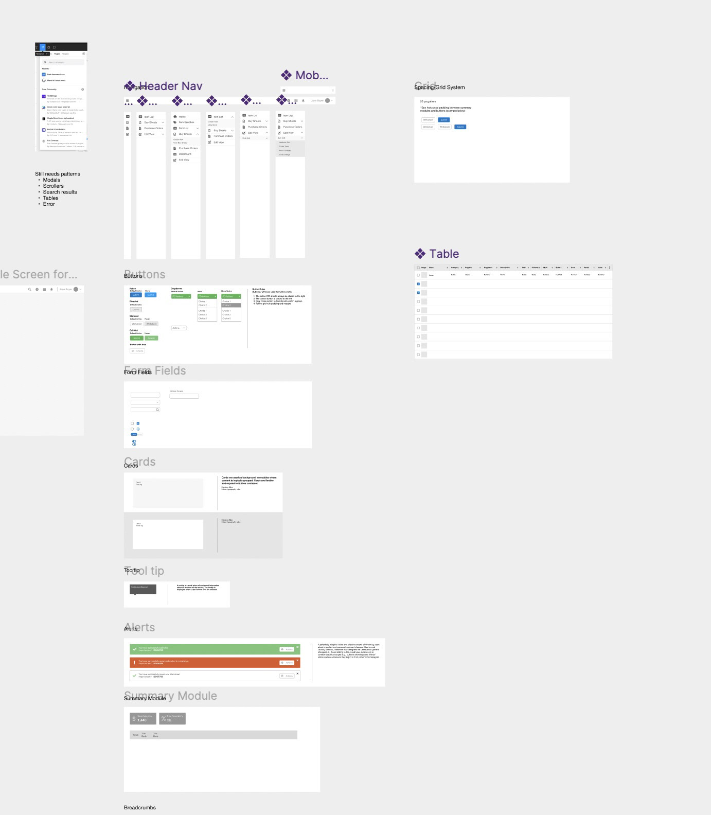
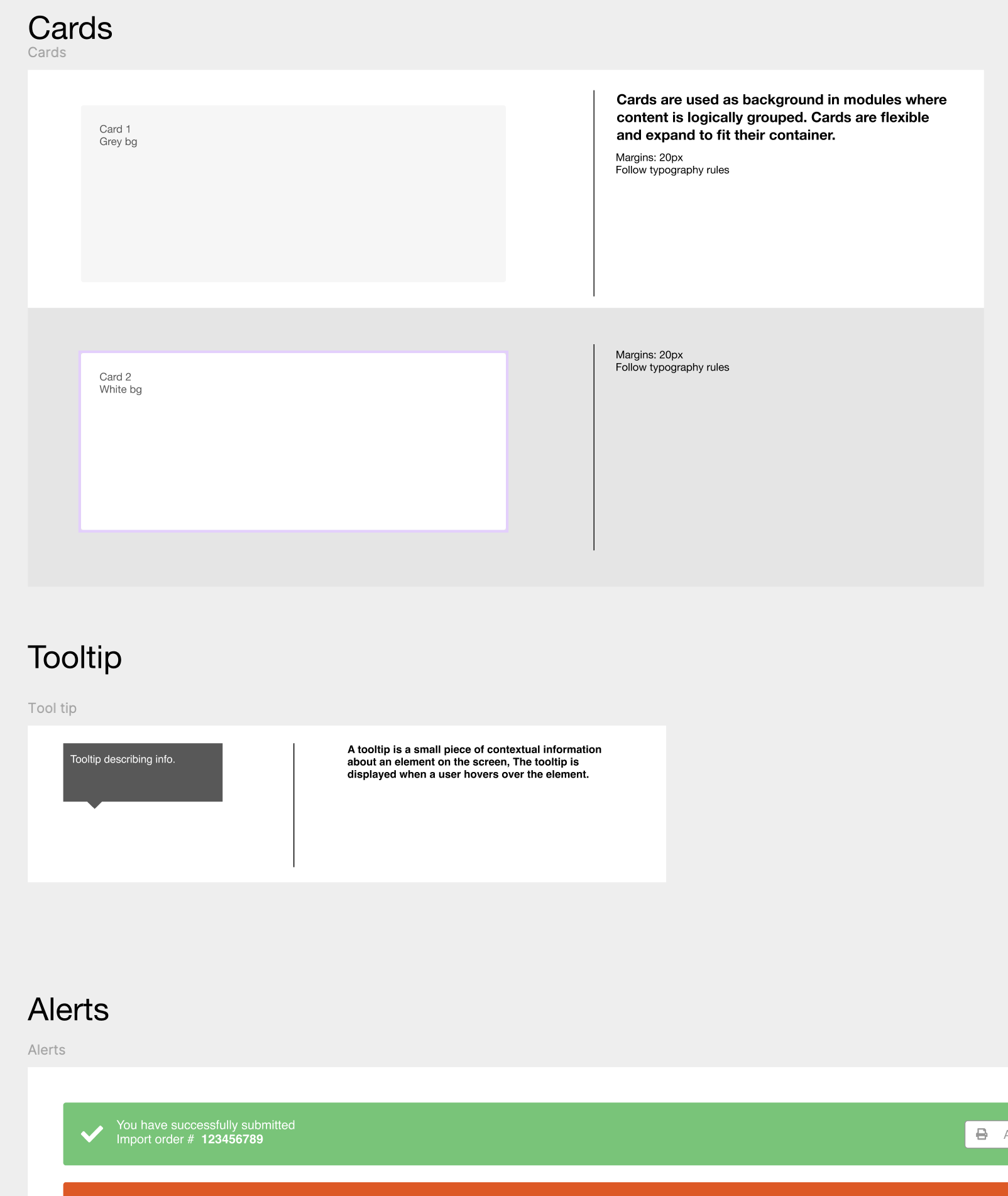
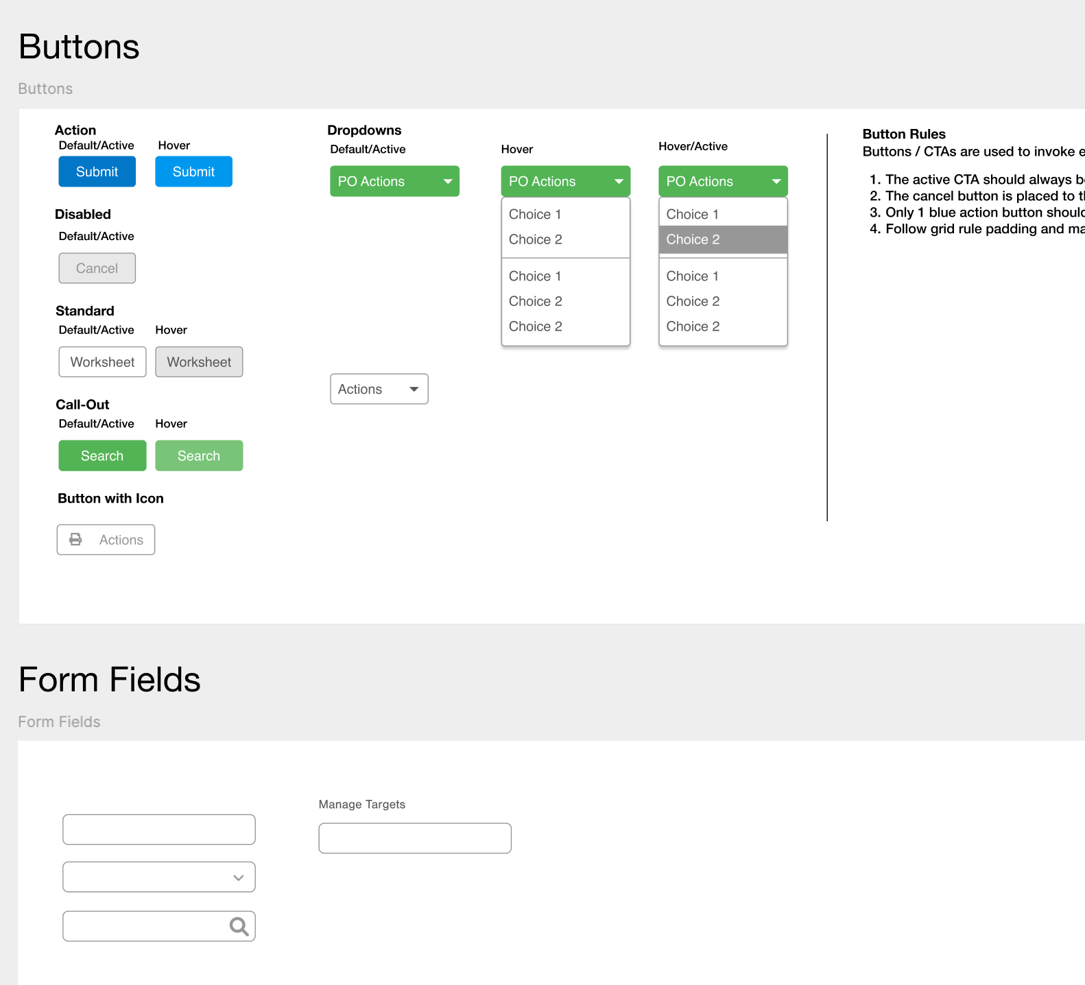
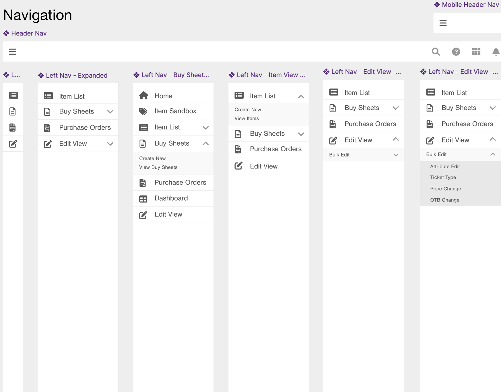
UI Kit Created From Scratch
After a thorough walk-through of an existing tool that the reps use for ordering and quotes, I moved on to starting the mid-fidelity component library. These components all had to be made from scratch since the client didn't have an in-house design team or a marketing department that kept at least a style guide.
Low Fidelity Prototypes
With all this and a limited amount of time, I prioritized what I was tackling first...Buy Sheet creation.

The main problem with buy sheets is that they take a long time to do, and the buyers were using MS Excel as their versioning technique. It's time-consuming and, if done wrong, costly. 

Users didn't know where they were in the process. They needed indicators about actions they could take depending on where they were in the buy sheet process.
Ver 1

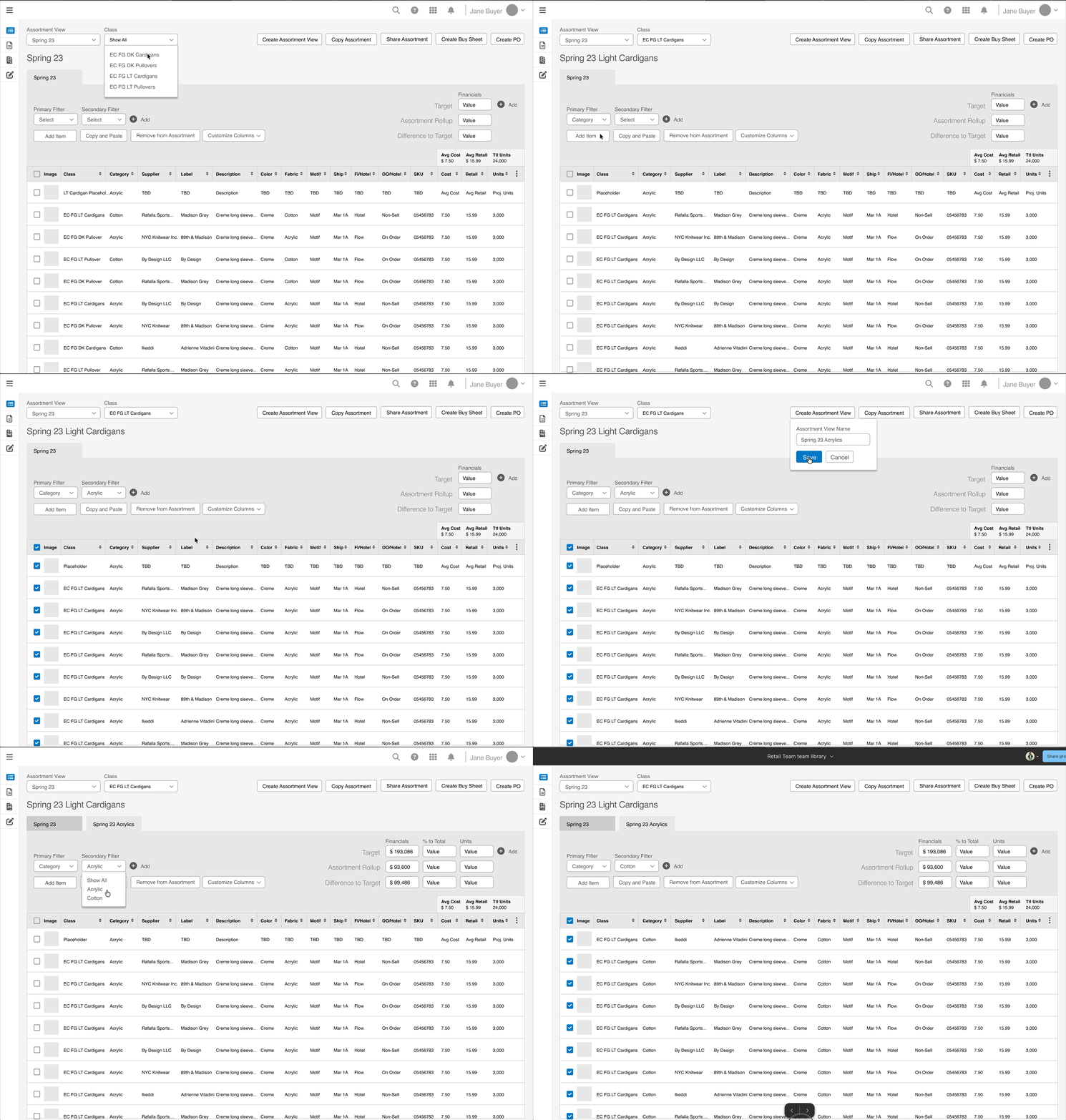
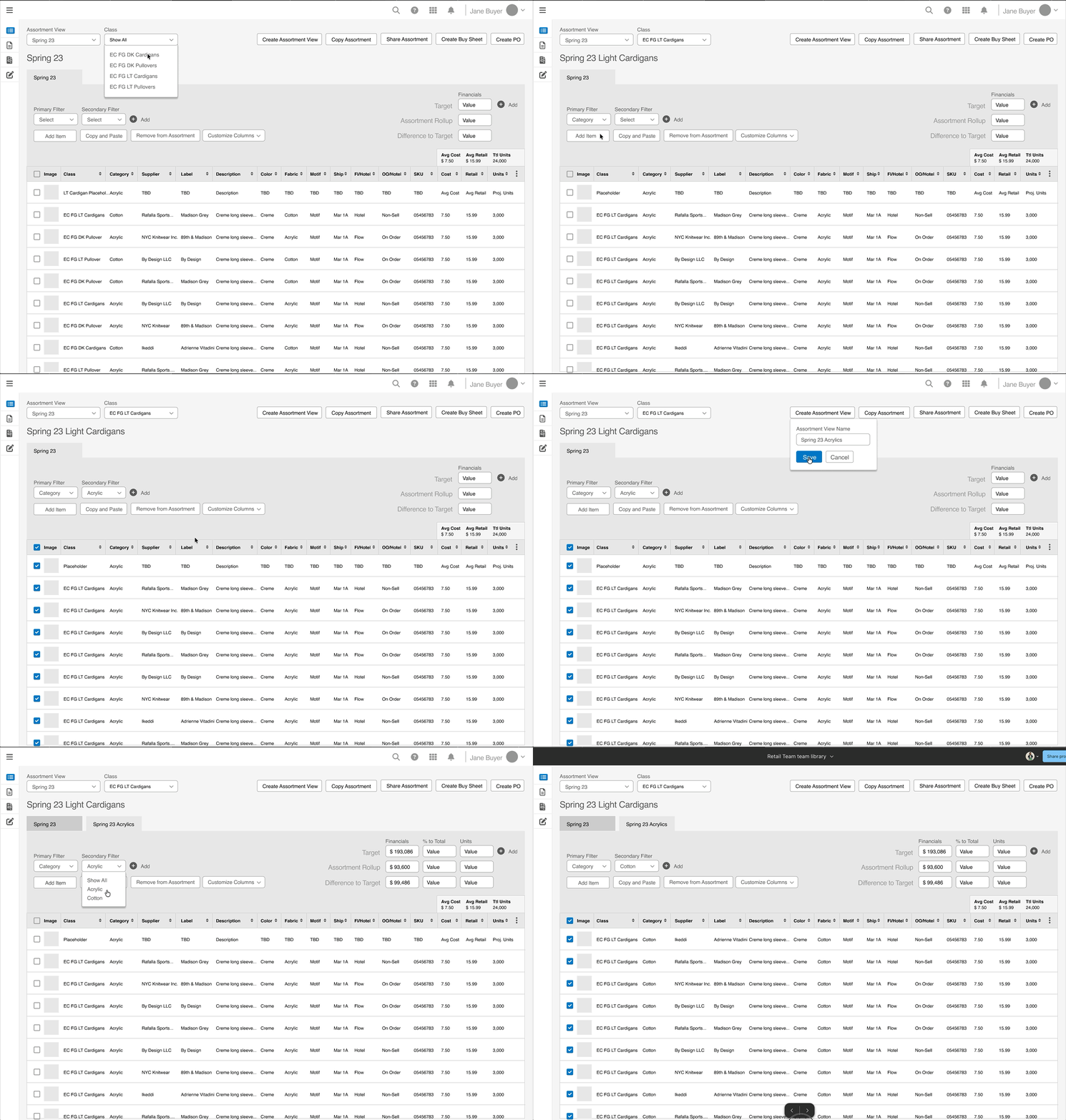
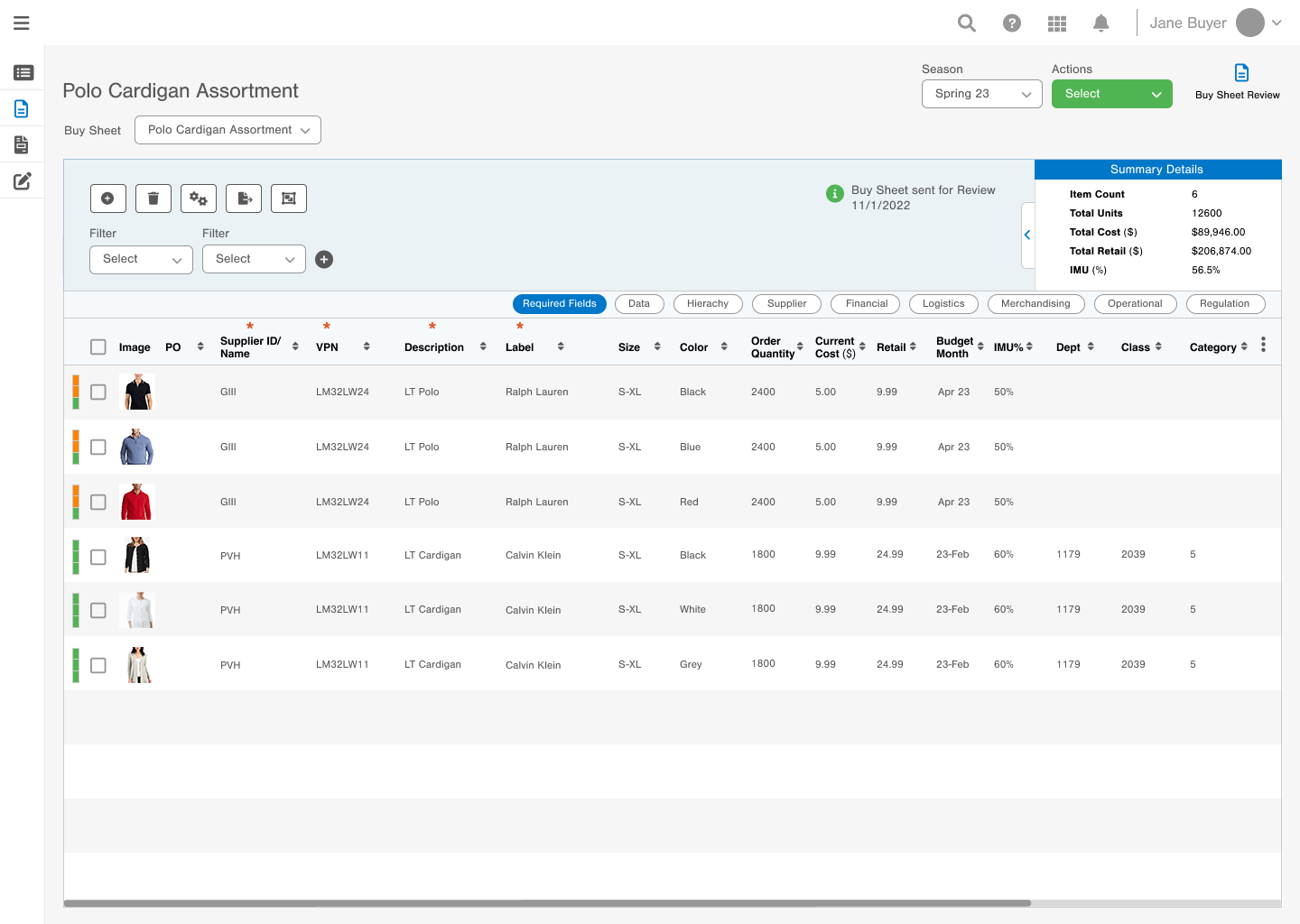
Here, the buyer is creating several assortment views to prepare for a buy sheet. They can see all the target values and financials necessary to create a buy sheet.
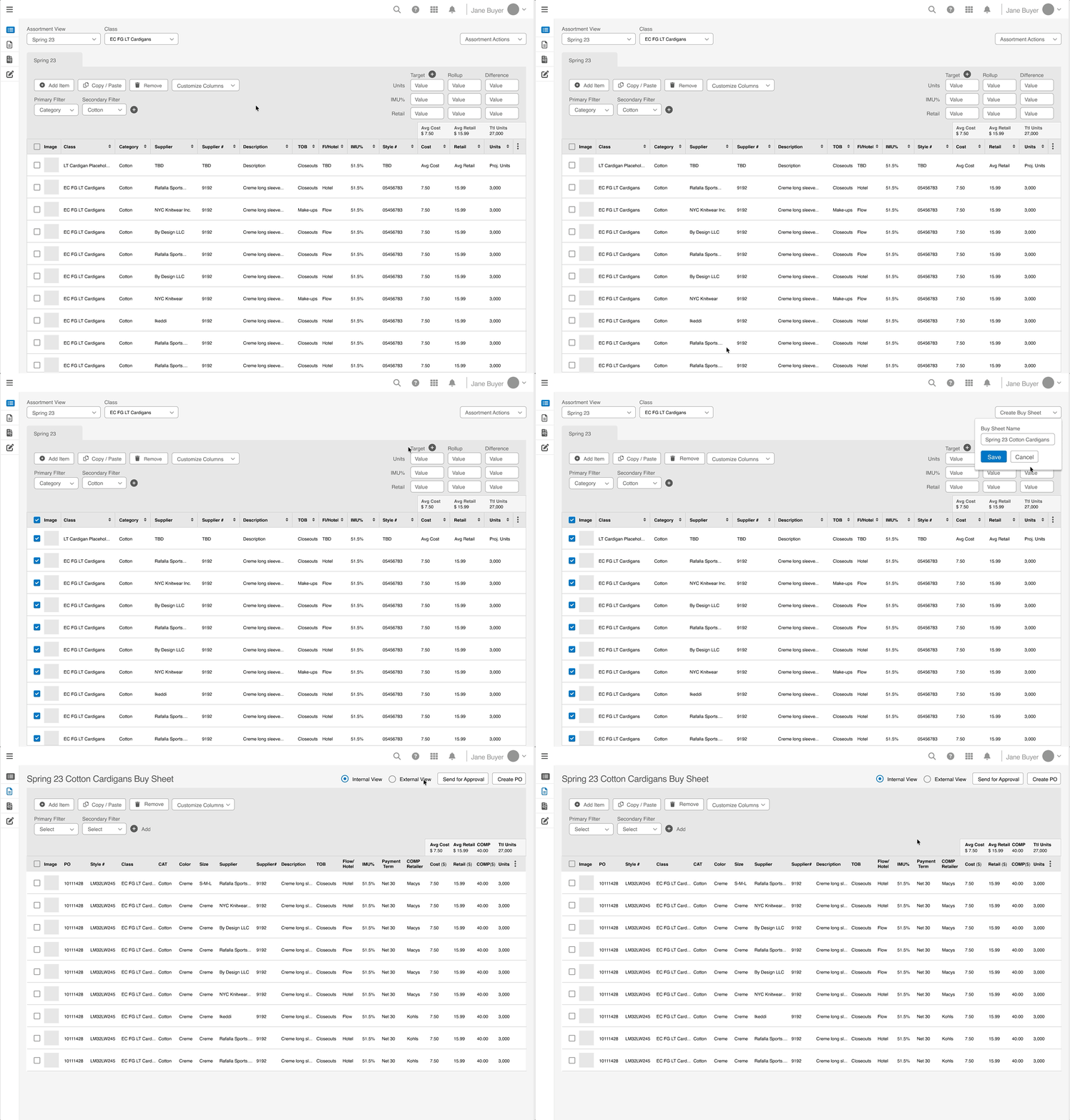
I ended up scrapping parts of this due to too many buttons after feedback sessions.
As stakeholder conversations went on, new priorities emerged for what actions buyers needed to take; some elements were taken out and put back in at any given moment due to new information trickling in.
Ver 2
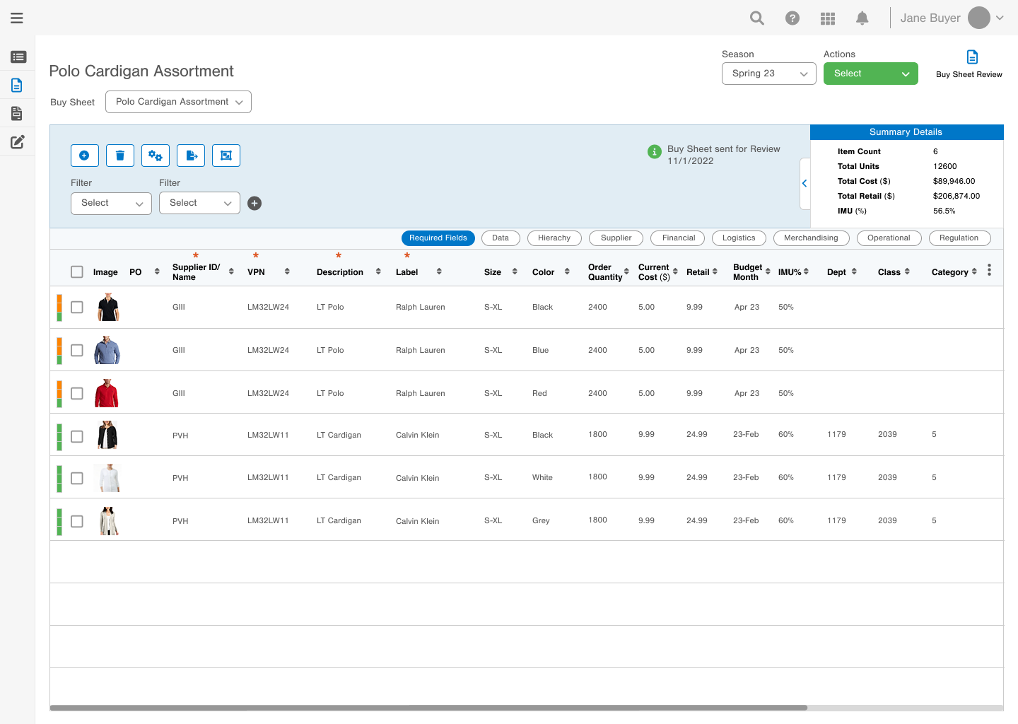
This is where the buyer creates a buy sheet (line sheet)

A complete line sheet leaves no buying question unanswered. Missing a wholesale price or a minimum order quantity stalls the order while the buyer waits for an email reply.

Buyers need internal and external versions of a purchase order to send to a vendor. 

External PO: Involves an outside supplier. It specifies exact quantities, agreed prices, delivery dates, and payment terms. Once accepted, it becomes a legally enforceable agreement used to process invoices and payments.

Internal PO: Involves only your own organization (e.g., shipping items from a central warehouse to a local branch). It focuses on internal stock transfers rather than financial settlements. In this case, internal POs need to be sent for approvals.
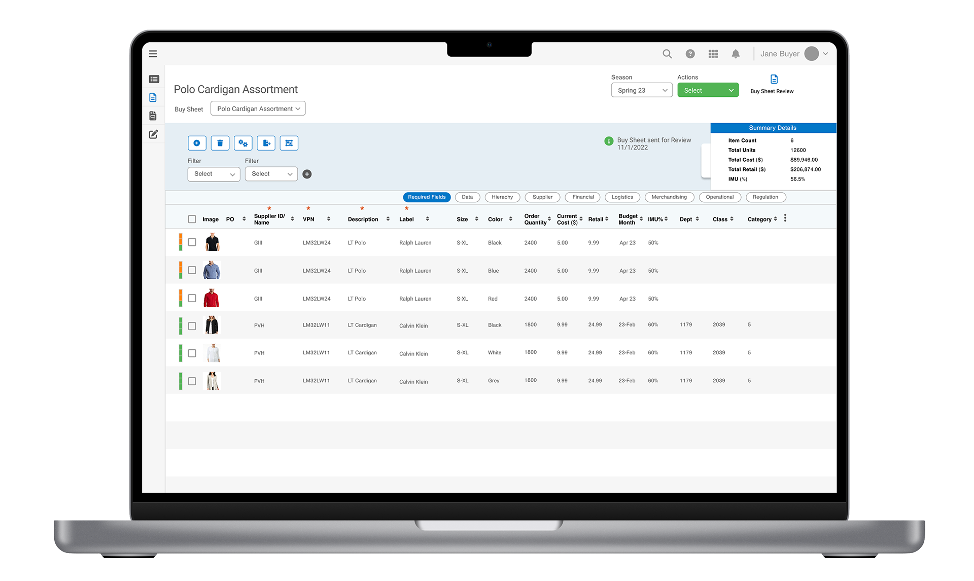
Creating a buy sheet is now as easy as an excel upload, PDF upload or creating the list from scratch and a couple of clicks instead of scouring through Excel files. 
Usability Testing
After getting final approval from leadership, I tested these concepts with 9 different key stakeholders who would definitely be interacting with the tool day to day. 

➡️ 1 week of testing time to accommodate all 9 users
➡️ Testing "time on task" from both the old system and the new system for. 

At the high level, these are the actions I was testing for:
➡️  Create an assortment sheet
➡️  Create a buy sheet
➡️  Create a purchase order
➡️  Send the purchase order to the vendor
Visual Treatments 
Some visual treatment was applied to give the client an idea of what the tool could look like with certain colors.

Bare Version

It's important to use color sparingly and only in areas where the user absoltely needs to take action in order to move on.

Key Takeaways and Reflection
This project was one of the most challenging and the most rewarding, and here's why:
I was working with a design manager who was going to be in the main client-facing role, but she constantly worked in a silo and didn't know how to delegate work. Her communication was lacking, and we would go into meetings misaligned on how to approach the next steps. This was frustrating in a more junior role because you expect the manager to be communicative, and it's a disappointing feeling when they aren't.
I dealt with this by deciding not to rely on her for questions. This was hard for me as teamwork is something I value. I had to work autonomously. I researched as much as I could using competitive analysis and best-in-class design principles to inform how to build a dashboard layout. Since we were on the same Figma board and she was actively using my components, I made sure to tag her in all my updates and document any questions I had in Figma comments. This built confidence and true ownership in my decision-making since I only had myself to rely on. 
The iteration turnaround times were challenging to say the absolute least. On the same day a new concept is presented, leadership would want a turnaround time that same day. 
I dealt with this by deprioritizing other flows or working with my manager to push the timeline out by a day. In the design world, turnaround times of about a day are normal. I was really tapping into my scrappy agency days because the client was so new to design and how it operates.
I would often point out details that my manager was missing from designs she made, which then led to me having to correct them. Simple things like missing a checkbox on a page or not deleting a scroller when there didn't need to be one. It only created more work for me to clean it up before a client meeting. 
I dealt with this by leaving myself time to deal with mistakes. For example, I'd ask her at the end of the day to copy and paste her designs into the shared Figma board I created so that I could have visibility into them, especially before client meetings. Her work also represents me and vice versa. Commitment to consistency became a value.

You may also like

Back to Top