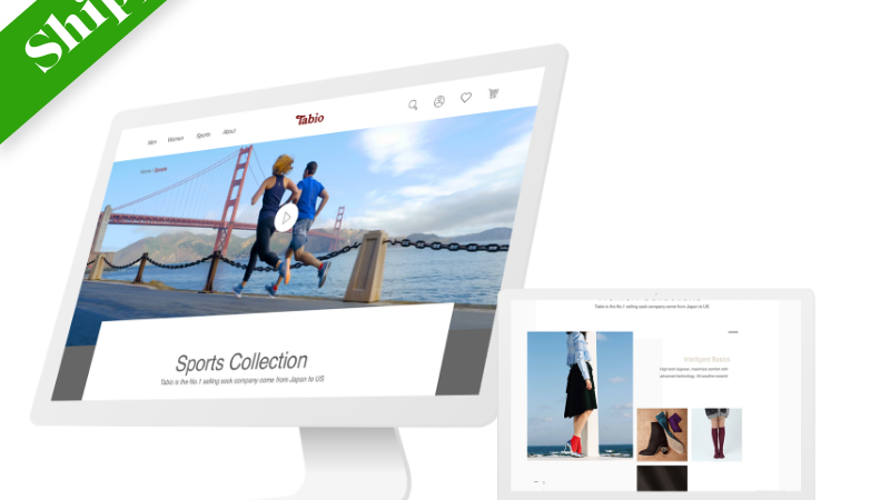
Tabio, a client who was breaking into the American market, needed a new webpage that would convert Instagram followers to Influencers of their sock brand
My goal was to create a webpage and launch that webpage in 2 weeks to convert users from being passive followers into active brand ambassadors for the Tabio Brand.
I first designed what the webpage was to look like, with feedback from users and clients, I then coded the webpage and made it responsive on mobile, tablet, and desktop platforms. With some help from my developer, I got the webpage up and running successfully before the deadline.
I got over 20 substantial submissions from people interested in being an influencer. The CEO of the company was impressed with my ability to communicate effectively, deliver work on time, and be open to senior level work.
Research
I asked the researcher that was staffed on my team for access to the Mailchimp data we were using and access to the Tabio Instagram page to better understand my users.
Sketches
Then I proceed sketches to provide clarity, purpose, and layout of my designs.
IDEA #1
Standard e-mail sign up with social media link redirect
IDEA #2
Smooth scrolling interface with magnification hover over headings on the right hand side.
Tried to incorporate an icon as a secondary interface option. Supervisor said they preferred less text. This was a possible solution.
IDEA #3: Chosen Interface
Segregated sections to show differences in section content
IDEA #4
Four boxes when clicked will open to more dropped down content
Eliminated scrolling for more user friendly experience for web and mobile
Idea 3 was liked best by my UX Lead and by the Creative Director. They liked that it incorporated text and visuals that allowed for easy scrolling. They also liked the idea of the form being at the bottom of the webpage.
Low Fidelity Mockups (Sketch)
After consulting with the design team and BA in charge of overseeing the endeavor, they decided that version #4 of my low fidelity wireframes were liked best.
Example Responsive Code
Live Site (Desktop)
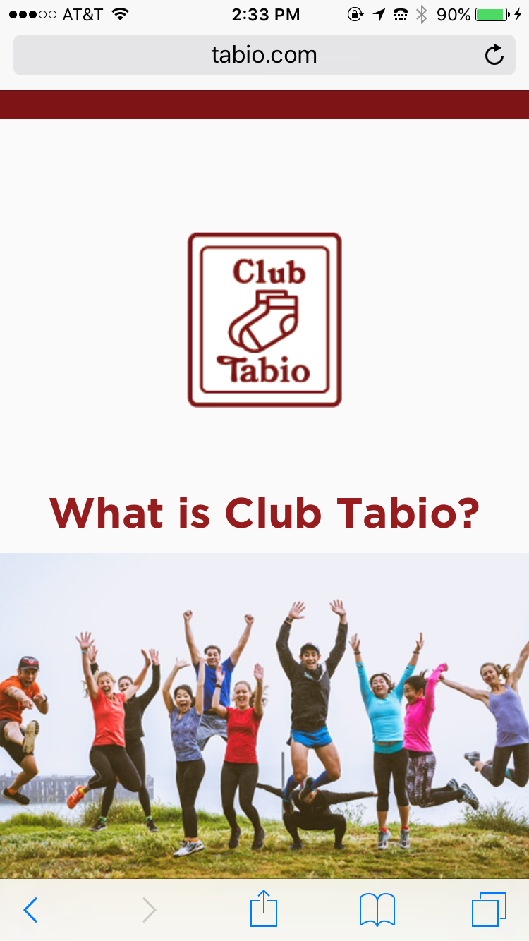
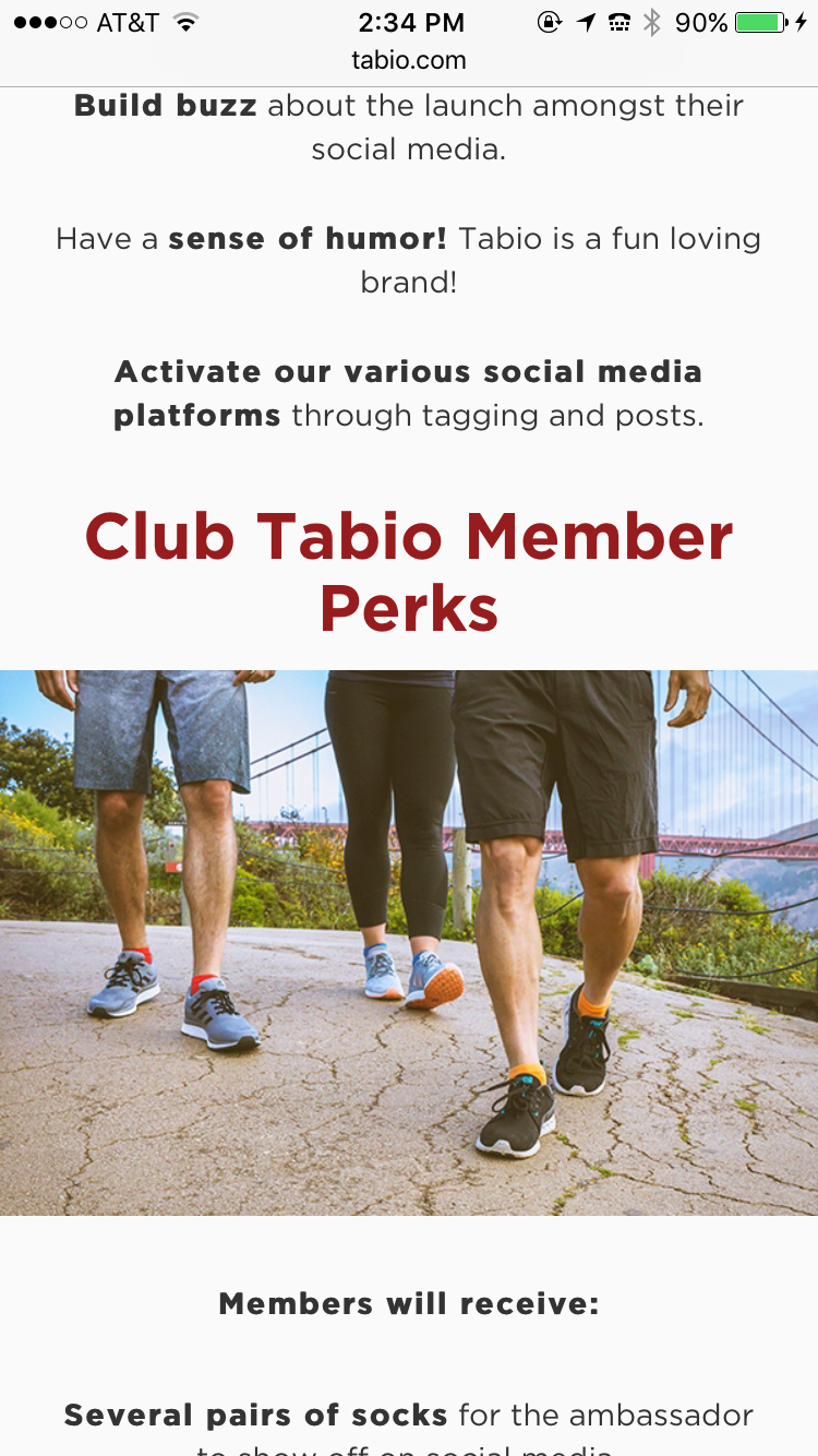
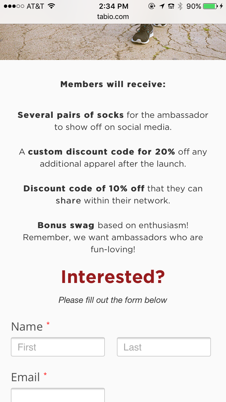
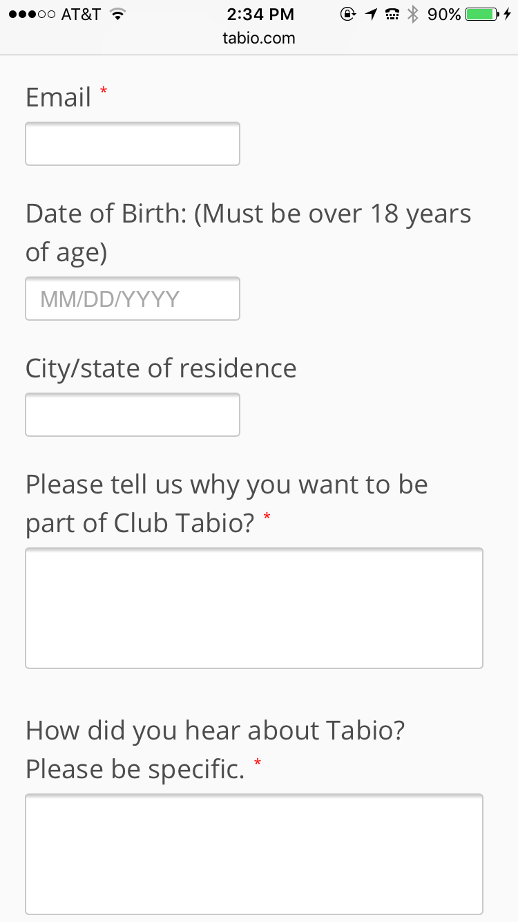
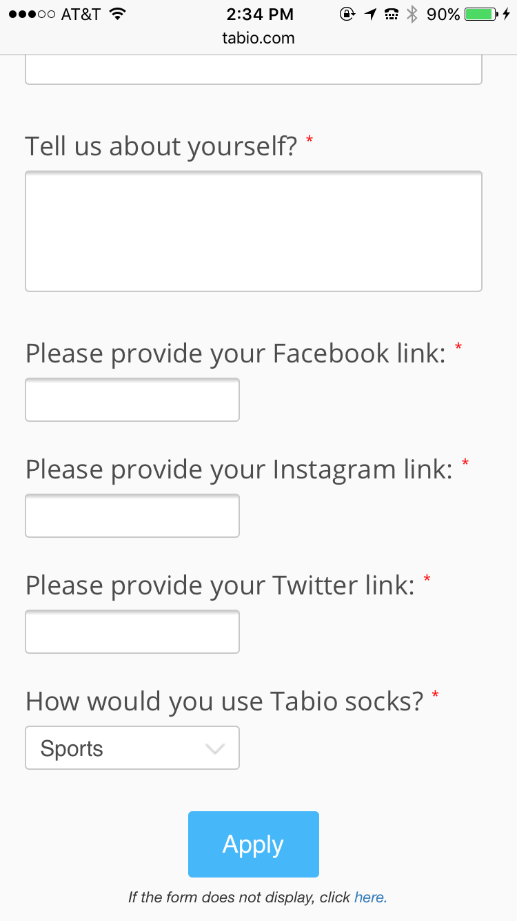
Screenshots of live site (iPhone 6)
We tested the site on an iPhone 6 and iPhone 4 (the most popular phone at the time) and found that the design was responsive.

Impact and Results
After launching the site and marketing the campaign using social media outlets, Tabio received:
1.) 2,000 instagram followers in 48 hours
Reflection
Overall, I am very proud of this design and the fact that I was trusted with this task. However, I would change a couple things:
1. I would have used different colors for different sections.
2. I would have to incorporate more motion design.
3. I would not center the text on the mobile design. I would align it to the left.
4. I would have included a footer.
