What's a Splash Screen?
A splash screen or launch screen is a short introductory screen shown when a user launches an app, website, or digital experience. Usually consisting of a company logo or name, a branded background image or graphic, and an optional loading indicator or animation, splash screens make a bold first impression and build brand awareness.
What's a Landing page?
A landing page is defined as a web page that serves as the first page the visitor has landed on when he or she visits your site.
A landing page could be the page the user has landed on after clicking on a Google search result, or after clicking on links from other sites, paid media banners, social media posts, email links, and so on.
Check out this project for more examples of a landing page.
Goals of a Landing Page
A landing page usually includes a clear call-to-action tied to a desired primary objective, such as capturing leads, generating sales, increasing sign-ups, driving content downloads and such. Regardless of the specific objective, typically, the wider goal remains the same: To convert visitors into qualified customers.
Step #1: Know your target audience
Audience personas are big help when asking these questions:
Who is your ideal target audience?
Why would they be interested in what you offer?
What is the pain you’re solving?
How do you solve that?
Step #2: Determine your business goals and key performance indicators (KPIs)
Carefully define the objective and stick to it throughout the entire working process. Make sure you’re focusing on just one objective. The main objective should be clear and prominent on your page. Every single element on your page, whether it’s an image, plain text or a video item, should directly support this one, single, desired action. This can be signups, follows, engagement, etc. Here's a list of KPIs.
Step #3: Design the landing page experience with both business goal and customers in mind
Step #4: Continuously test and optimize
Optimization requires testing, and A/B testing is always a good methodology for optimizing your landing pages since you can never simply rely on hunch or gut feeling when guesstimating what will work best for your target audience. Test different headlines, page copy, page length, structure and element positioning, usage of navigation menus and any changes to the overall design.
Elements of a Landing Page
1. The copy
Write in a clear and conversational way. Drop the buzzwords and marketing fluff. Write like you talk, in first person. Exactly like you would write an email to a friend.
Structure the copy around a single objective. There should be a strong, clear call-to-action. The text around it should encourage readers to tak action and reinforce the CTA.
Include social proof based on real examples. Fill the copy with real examples, from real people and real brands. Forget about using generic stock photography and fake stories. Be authentic and real.
2. The call to action (CTA)
It is usually a good rule of thumb to use contrasting colors or surround the CTA button with whitespace to distinguish it from other elements. Consider different patterns, layouts, proportions, and sizes.
Choosing the right size and design is very important since you want it to be attractive and motivational, but you don’t want it to be disproportionately large; otherwise, it may overpower everything else.
3. Trust indicators
Showcase positive testimonials, related endorsements, reviews, successful case studies, well-known logos of clients you’ve done business with, professional certificates you’ve earned, awards you’ve won and so on.
4. Hero shot
The “hero shot” is a graphical representation of your product or offer – placed in a prominent position on the page while directly supporting the headline and overall messaging – in the right context and to the right users. A great hero shot can motivate a sense of empathy and grow an interest in your offering.
5. Benefit statement
Include a detailed explanation about your offer’s benefits. For easy reading, it is always a good idea to organize the benefits using bullet points instead of a one-block paragraph.
6. Use Color Psychology
Whether your landing page is mostly black, white or gray, it’s common to have a neutral page color with the most important item on the page being a contrasting color that catches the eye. Whether it’s a form that you want customers to fill out or a button you want them to click, make sure the color guides visitors so they don’t have to guess what you want them to do or where they should click. If you’re not sure which of your brand colors will grab users attention the most, perform an A/B test. Try one color for a callout button for at least a month and keep track of the conversions you get, then switch the color and compare your results after the same amount of time has passed.
7. Optimize Your Forms
Many businesses try to get as much information as possible out of visitors, but you might be asking too much. Long forms where you have to enter a lot of personal information could deter your visitors from completing the form, costing you a conversion. Keeping forms simple and only requesting essential information is the best way to start the sales process. You can always inquire more information once you’ve started the relationship. Additionally, it’s important to include messages and labels that are easy for users to understand. You don’t want your users to have to guess what information you’re asking for or discontinue the process because they’re confused.
8. Speed up your page
Your landing page should be loaded within 0-2 ideally but in a worst-case in 2-4 seconds, if not, it’s definitely something you should work on as research on the Impact of Site Speed on Your Conversion Rate by Portent in 2019 found out that:
“When pages load in less than 1 second, the average conversion rate is almost 32%. At a 1-second load time, the conversion rate already drops to 20%. At 2 seconds, the conversion rate begins to level off at 12-13% and reaches its lowest at a 5-second load time.”
+ 0-4 second load time is best for conversion rates
+ The first 5 seconds of page load time have the highest impact on conversion rates
+ Website conversion rates drop by an average of 4.42% with each additional second of load time (between seconds 0-5)
Elements of a Splash Page
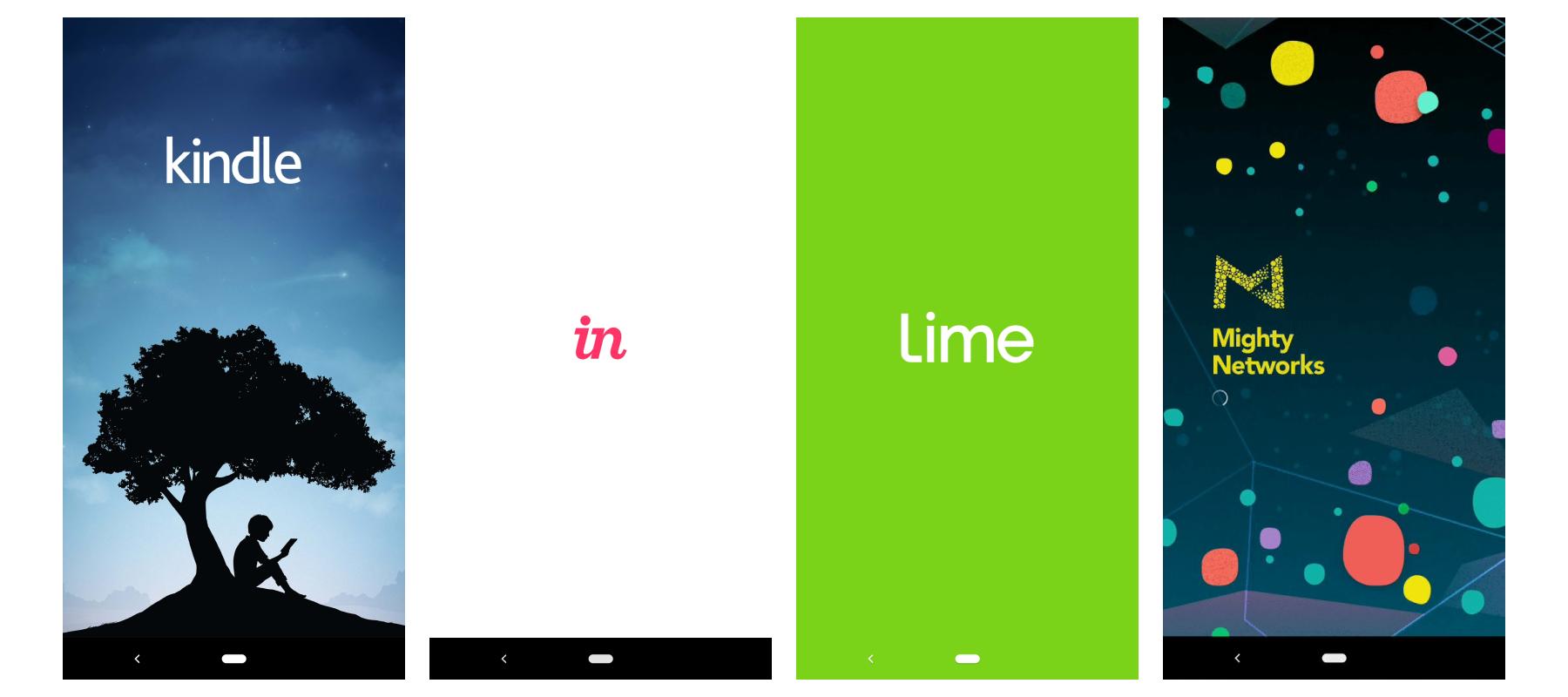
Keep your design simple, but not ordinary
Use eye-catching colors, creative background images, original logos, and subtle animation to make your design compelling without being overbearing. Keep your design simple—avoid adding text, advertisements, or other design elements that take longer to digest.

For Kendall's take on splash pages, see this project
For Kendall's take on splash pages, see this project
Goals of a Splash Page
Welcome users
Great user experiences begin the moment a user opens your app. Splash screens serve to set the scene for users, letting them know “we know you’re here.” It’s kind of like arriving at a restaurant—your server passes by your table after you’re seated, just to let you know they’ll be right with you as soon as they’ve looked after that table over there. It’s a small touch, but it eases users’ perception of the rest of the experience.
Manage users’ perceptions and expectations of your app
Splash screens help give a little boost to perception from the moment users open the app, helping to reduce abandonment and manage users’ expectations from the first moment.
Smooth out unavoidable delays in loading
Even on premium devices, waiting is often unavoidable—tasks like loading user data or authenticating with remote services take time to set up before users can begin interacting with the app.
Splash screens help reduce user anxiety around waiting. They make the wait feel shorter, giving users confidence that the app is still loading and sometimes giving real-time feedback to let them know how long it will take.
Spinners and other open-ended loading indicators work well for short delays, but they can sometimes make waiting feel like it’s taking even longer, so try to avoid them if your app takes a while to load. Instead use a loading bar with a percentage indicator.
Engage Users
If your mobile or web app takes time to load, make the experience more interesting by switching images, showing interactive graphics, or displaying the system’s current state to the user to make them aware of what is going on in the application process.
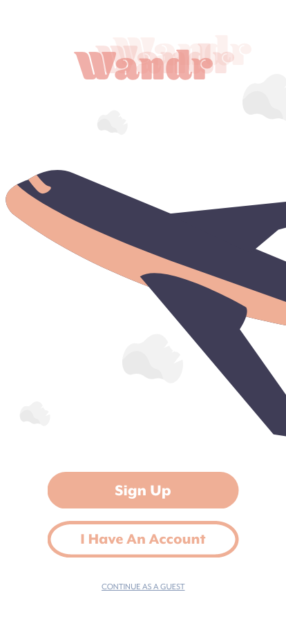
Landing Page Deconstruction