Definition: Navigation menus are lists of content categories or features, typically presented as a set of links or icons grouped together with visual styling distinct from the rest of the design.
1. Don’t use tiny menus (or menu icons) on large screens. Menus shouldn’t be hidden when you have plenty of space to display them.
2. Put menus in familiar locations. Users expect to find UI elements where they’ve seen them before on other sites or apps (e.g., left rail, top of the screen). Make these expectations work in your favor by placing your menus where people expect to find them.
3. Make menu links look interactive. Users may not even realize that it’s a menu if the options don’t look clickable (or tappable). Menus may seem to be just decorative pictures or headings if you incorporate too many graphics, or adhere too strictly to principles of flat design.
4. Ensure that your menus have enough visual weight. In many cases, menus that are placed in familiar locations don’t require much surrounding white space or color saturation in order to be noticeable. But if the design is cluttered, menus that lack visual emphasis can easily be lost in a sea of graphics, promotions, and headlines that compete for the viewer’s attention.
5. Use link text colors that contrast with the background color. It’s amazing how many designers ignore contrast guidelines; navigating through digital space is disorienting enough without having to squint at the screen just to read the menu.
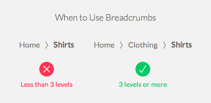
6. Tell users ‘where’ the currently visible screen is located within the menu options. Users rely on visual cues from menus (and other navigation elements such a breadcrumbs) to answer this critical question. Failing to indicate the current location is probably the single most common mistake we see on website menus. Ironically, these menus have the greatest need to orient users, since visitors often don’t enter from the homepage.
7. Use understandable link labels. Figure out what users are looking for, and use category labels that are familiar and relevant.
8. Make link labels easy to scan.
9. For large websites, use menus to let users preview lower-level content. If typical user journeys involve drilling down through several levels, mega-menus (or traditional drop-downs) can save users time by letting them skip a level (or two).
10. Provide local navigation menus for closely related content. If people frequently want to compare related products or complete several tasks within a single section, make those nearby pages visible with a local navigation menu, rather than forcing people to ‘pogo stick’ up and down your hierarchy.
11. Leverage visual communication. Images, graphics, or colors that help users understand the menu options can aid comprehension. But make sure the images support user tasks (or at least don't make the tasks more difficult).
12. Make menu links big enough to be easily tapped or clicked. Links that are too small or too close together are a huge source of frustration for mobile users, and also make large-screen designs unnecessarily difficult to use.
13. Ensure that drop-downs are not too small or too big. Hover-activated drop-downs that are too short quickly become an exercise in frustration, because they tend to disappear while you’re trying to mouse over them to click a link. On the other hand, vertical drop-downs that are too long make it difficult to access links near the bottom of the list, because they may be cut off below the edge of the screen and require scrolling. Finally, hover-activated drop-downs that are too wide are easily mistaken for new pages, creating user confusion about why the page has seemingly changed even though they haven’t clicked anything.
14. Consider ‘sticky’ menus for long pages. Users who have reached the bottom of a long page may face a lot of tedious scrolling before they can get back to the menus at the top. Menus that remain visible at the top of the viewport even after scrolling can solve that problem and are especially welcome on smaller screens.
15. Optimize for easy physical access to frequently used commands. For drop-down menus, this means putting the most common items close to the link target that launches the drop-down (so the user's mouse or finger won't have to travel as far. Recently, some mobile apps have even begun reviving pie menus, which keep all the menu options nearby by arranging them in a circle (or semicircle).
Dropdown boxes and menus are overused and clunky but can be useful for revealing a list of options or commands.
One line of text shows a page's location in the site hierarchy. User testing shows many benefits and no downsides to breadcrumbs for the secondary navigation.
+ Breadcrumbs show people their current location relative to higher-level concepts, helping them understand where they are in relation to the rest of the site.
+ Breadcrumbs afford one-click access to higher site levels and thus rescue users who parachute into very specific but inappropriate destinations through search or deep links.
+ Breadcrumbs never cause problems in user testing: people might overlook this small design element, but they never misinterpret breadcrumb trails or have trouble operating them.
+ Breadcrumbs take up very little space on the page.
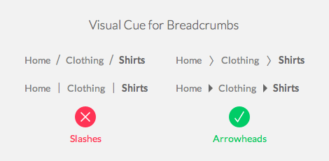
Breadcrumbs are almost always implemented the same way, with a horizontal line that
+ progresses from the highest level to the lowest, one step at a time;
+ starts with the homepage and ends with the current page;
+ has a simple text link for each level (except for the current page, because you should never have a link that does nothing); and
+ has a simple, one-character separator between the levels (usually ">").
+ should show the site hierarchy, not the user's history. (I.e., use location-based breadcrumbs, not path-based ones.)
For example, if you allow users to winnow a large product database by specifying attributes (of relevance to users, of course), the breadcrumb trail can list the attributes that have been selected so far. A toy site might have breadcrumbs like these: Home > Girls > 5-6 years > Outdoor play (note that the links should be colored as well as underlined, but I don't do this here to avoid confusion with these dummy links)
Hamburger Navigation: Mobile First is NOT mobile only.
Summary: Discoverability is cut almost in half by hiding a website’s main navigation. Task time is longer and perceived task difficulty increases.
Hidden navigation is less discoverable than visible or partially visible navigation.
When navigation is hidden, users are less likely to use navigation.
If people use hidden navigation, they do so later in the task than if it were visible.
Hidden navigation provides a worse user experience than visible or partially visible navigation does, in both mobile phones and desktop user interfaces. This finding holds true across multiple UX metrics including users’ assessment of task difficulty, time spent on task, and task success.
On desktops, hiding navigation degrades the experience and the navigation discoverability more than it does on the phones.
Hiding the navigation mostly affects content that is not directly accessible through an in-page link.
Hidden navigation: the main navigation links were placed under an icon (such as the hamburger) or button and required an explicit user action to be displayed.
Visible navigation: the main navigation links were shown in a visible navigation bar and could thus be seen by a simple glance without needing any prior action.
Combo navigation: some of the main navigation links were visible and some were hidden under a menu.
After going through the study provided by NN researchers, results indicate that, across both these measures, hidden navigation was significantly less discoverable than visible or combination navigation:
Both on mobile and on desktop, people were significantly more likely to use the navigation when all or some of the navigation options were visible (that is, in the visible and combo conditions).
On desktop, people used the hidden menus in only 27% of the cases, while they used visible or combo navigation almost twice as much: in 48% and 50% of the cases, respectively.
On mobile people used the hidden navigation in 57% of the cases, and the combo navigation in 86% of the cases — 1.5 times more.
People were significantly more likely to use the navigation (whether hidden or partially visible) on mobile than on desktop.
On both desktop and mobile, when the navigation was hidden, it took participants longer to use it than when it was visible or partly visible. Our mixed-effects generalized model showed that this result was marginally significant (p < 0.1).
Content discoverability. Our tasks were fairly simple and gave users a fair amount of freedom (e.g., “Find a technology article that interests you”), so people were actually able to complete them most of the time. However, given the focus of our study, we used a more nuanced measure of success (content discoverability) that took into account not only whether people completed the task, but also how they completed it. Thus, content discoverability measured whether users were able to find the content they were looking for by using navigation (and not search) in those cases when the content wasn’t directly linked from the homepage.
Task-difficulty rating. At the end of each task, we asked participants to rate how easy or difficult the task was on a scale from 1 to 7, with 1 being easy and 7 being difficult. The task difficulty is a subjective metric; it measures users’ self-reported assessment of the task. It usually reflects their overall experience in using the site, so a high estimated difficulty rating will indirectly indicate actual difficulty in locating the navigation and navigating through the site.
Time on task. This metric represented the time it took participants to complete the task, whether successfully or not. A menu can add or decrease task time, if it is easy or difficult to find, open, or use, so longer task times also reflect the added interaction cost due to less usable navigation.
1. Both on mobile and desktop, the content discoverability was significantly lower when the navigation was hidden. This measure showed a more than 20% drop in discoverability on sites with hidden navigation, compared with sites with visible or combo navigation. In other words, visible or combo navigation made people more likely to complete the task successfully and without relying on search.
2. Hidden navigation led to significantly higher difficulty ratings than visible or combo navigation: the difficulty rating showed a 21% increase in the hidden-navigation condition compared to visible, and 11% increase when compared to combo navigation. This result is consistent with our other findings and strengthened the conclusion that hiding navigation makes it harder for users to complete their tasks. Visible navigation was ranked as least difficult, most likely because it was easy to discover and users could immediately scan the navigation options and select one of them. The other navigation types hide navigation options and increase the interaction cost.
3. Users took significantly longer to complete tasks on sites with hidden navigation than they did on sites with visible or combo navigation on both desktop and mobile.
On the desktop, people were at least 39% slower when the navigation was hidden (compared with the visible or combo conditions).
On mobile people were 15% slower when the navigation was hidden (compared with the combo condition).
Desktop: There is plenty of screen real estate for displaying navigation options, and we recommend:
Do not use hidden navigation (such as hamburger icons) in desktop user interfaces.
Instead display the top-level navigation options, usually across the top of the page or down the left side.
Mobile: For phones, there is no hard-and-fast rule. But our general recommendations are:
If your site has 4 or fewer top-level navigation links, display them as visible links.
If your site has more than 4 top-level navigation links, the only reasonable solution is to hide some of these. We did find that the usability penalty imposed by hidden navigation is very present on mobile, but it is smaller than on the desktop. Thus, we recommend making this design tradeoff because the usability of an expandable navigation menu is far better than that of alternative designs.
Provide in-page links to important information on your site, or use other methods of supporting the hamburger (or some other hidden) menu.